18

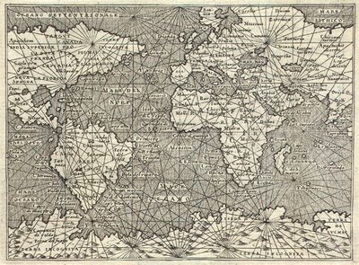
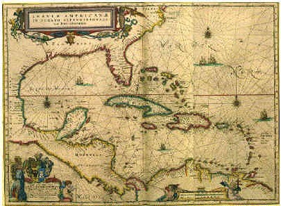
Many old maps have lines like below. Is there a term for a map with that type of lines? enter image description here enter image description here (from http://r-russell0912-dc2.blogspot.com/2011/01/pirate-maps-and-old-maps.html)

My best hypothesis is that the lines may be related to Rhumb lines and therefore Mercator projections.

Beautiful Example.

3
  • I think this is an example of a question that can correctly exist on 2 different SE sites--you might consider posting this question on gis.stackexchange.com with a cartography and history tag. There are lots of good cartographers there. Commented Aug 13, 2012 at 9:56
  • gis.stackexchange.com/questions/31376/…
    – Dale
    Commented Aug 13, 2012 at 13:27
  • I don't understand "pin-wheels" here. What is this supposed to mean ? Commented Aug 29, 2014 at 12:16

2 Answers 2

11

The first thing I can think of is Portolan charts, the Wikipedia page is not very clear but it links here which has some more information. (full frameset for the second link)

The lines themselves (Contemporaneously called rhumblines, but that term has since been redefined for modern usage.) are today termed windrose (or bearing) lines: lines of constant (observed) bearing between points. The link describes the significant behaviour difference between windrose lines and geodesics: the latter require latitude determination while the former do not. Before the invention of modern navigational chronometers in the mid-18th century it was impossible to sail geodesics, but quite possible to sail windroses; at the cost of a somewhat longer route.

3
  • 5
    +1. I think it would make this answer more valuable though if you'd quote their paragraph on what the lines were for. That was the main thrust of the question.
    – T.E.D.
    Commented Aug 13, 2012 at 13:55
  • @T.E.D. That paragraph essentially says, "yep, they're Rhumb lines for each of the primary, half-, and quarter-winds in Mercator projections", confirming JoeHobbit's suspicions. Commented Aug 13, 2012 at 17:27
  • @SevenSidedDie: Careful there; the meaning of rhumbline has changed in the interim, so do you mean the modern meaning or the contemporaneous one? Commented Dec 13, 2017 at 19:45
3

It is called a portolan chart.

The lines have no navigational purpose. They were used to copy the chart. The same pattern of lines is drawn on the copy as on the master and then the copyist draws the coastlines using the individual cells of the grid as a reference.

For example, in the first chart you give, the lines are formed by drawing a great circle and then dividing it into 16 parts, each point on the circle being a node. Then lines are drawn between each of the nodes so there are a total of 16 x 15 = 240 lines altogether. The same thing is done on the copy. (Note that the copy can be done on a parchment of a different size than the master.) Thus, each chart will have the exact same pattern of lines. The coastlines and towns are then drawn with reference to the cells made by the lines. Because each cell has a unique shape there is no chance of accidentally copying the contents of one cell to the wrong one, as would be the case if you used a grid having all cells the same shape.
1
  • 1
    You get three upvotes for this nonsense! Those lines are windrose lines, lines of constant bearing, which before invention of the modern chronometer were the only way to sail accurate courses. Commented Dec 13, 2017 at 19:41

Your Answer

By clicking “Post Your Answer”, you agree to our terms of service and acknowledge you have read our privacy policy.

Not the answer you're looking for? Browse other questions tagged or ask your own question.