For me, this is not a question of "where is a tool to do cartography for me" but rather "how do I build a map that shows what I want to show". The first is something that doesn't exist, at least in a way that it would be free for everyone and easy to use. The second is something that we can all develop through patience and learning.
What to Observe in Making Historical Maps?
To begin with, in today's age and with commonly accessible technology, it is relatively easy to make a map. I say relatively because making a map does not make one a cartographer, and it will take a while to understand why and how some aspects of map-making fall into place.
For example, extremely important questions that one would have to understand before making a map are:
- the extents of the area being shown, in order to know what projection should be used;
- what data should be shown;
- what modern data is an apt proxy for historical datasets.
The best easy-to-access reference material for the first of these questions is ESRI's Understanding Map Projections.
The second is, of course, up to the individual map maker.
The third relies on approximations. It is relatively easy to find modern GIS datasets. I use the odd 'relatively' again here because depending on what you want to find, it may or may not exist (e.g., a few online searches will provide good world coastlines & natural borders while I had to delve very deeply into some national GIS office pages to find a small-scale map of Latvian counties).
The last is, actually, very important because it is easy to find historical GIS datasets that are correct on a large scale (continent) but which miss important details on the small scale (county). I found this search on GIS SE interesting if not particularly helpful (American railroads, anyone?), but there have been some other posts there that do point to useful datasets.
One should also have a basic understanding of whether, in recorded history, the landscape that needs to be represented has changed (e.g., for the Mediterranean, whether Santorini still was a circular island; for the Baltic, what was the coastline at that point as land has been rising due to isostatic rebound; for rivers, what modern engineering works have diverted their course; etc...). Yet, the previous question -- whether this affects the map is also important because if the changes are not relevant at the scale the area will be displayed, the map-maker can ignore them.
How to Make a Map?
Obviously, there exist numerous software which are very useful when making maps. A well-known freeware option is QGis, which has a very steep learning curve but also comes with great capabilities! There are numerous tutorials online that should be easy to find via Google which relate to how loading data works and what options exist for display.
It would be my preference to not mention paid-for software as I don't want this to be an advertising post -- if QGis feels too 'something', Google/Bing are likely to help the searcher to many other options.
What is more important, however, is how the software is used and what sort of outputs are determined. For those starting out, WP Map describes the basic of what a map is and what should be on it. In general, the principles I follow are that all data on the map should also be explained by it so a legend, scale, north arrow, coordinate grid are all necessary -- but this is an individual approach. For many historical maps, a coordinate grid and a north arrow might not have utility while a scale becomes more important.
One should also have an idea what is going to happen to the map at the end:
- If some sort of interactive, clickable, item is the target, then the user will likely need to continue to the end with some data format that allows for that (SHP / DXF);
- If the map is going to be a part of academic literature or, really, any publication, it should be vectorized (EPS / EMF / PDF);
- If the map is going to be a part of a series of maps, there might be arguments for rasterizing it (PNG / JPG / PDF).
As a caveat, I find nearly always that rasterized maps lose in precision and detail without having many upsides (for my uses). They are, however, easier to include on websites and such, so might find their purposes there if this is your intention.
General Disclaimer
Also, any dataset that can be downloaded will be subject to certain copyrights that should be followed and observed. The accuracy of a downloaded dataset will also be up to the user to verify.
I have provided two examples below which broadly follow the same methodology. One is a quick-and-dirty option, the other took a bit more time, but followed the suggestions from above more closely.
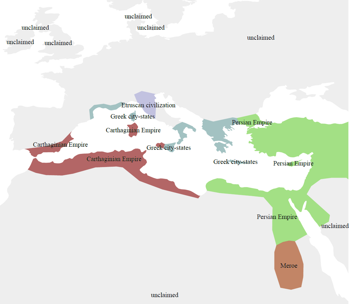
Example #1: Mediterranean Large-Scale (Simple)
- Download the dataset from here for 500 BCE (link to where links here is above as well).
- Load it into a GIS program.
- Assign colours & symbols to the entities (political in this case) one wants to show. Automatic labelling of the data was added here as well.
- Export.

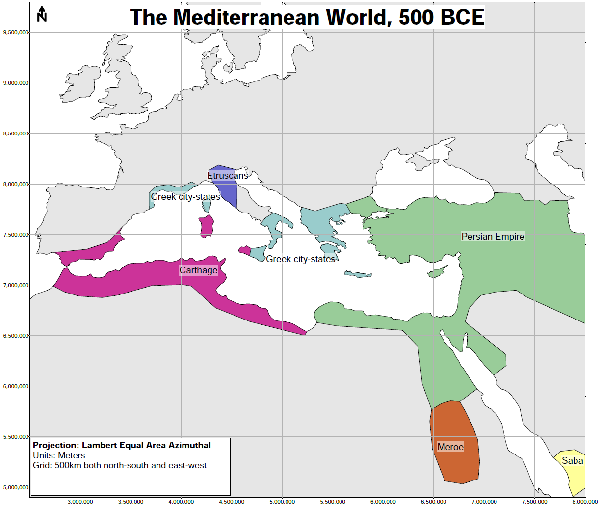
Disclaimer: I did not actually include a legend, scale, nor change the projection system from the geographic latitude/longitude that the original dataset comes in. This was to demonstrate a method for generating a map instead of necessarily providing a "good" map.
Also, I hope this scale already demonstrates how -- at least in this dataset -- how the "large-scale" features necessarily give way to small border fluctuations, etc. The "necessarily" is because the more points exist in a line, such as the one which describes the southern border of Carthage, the more processing intensive and computation is with that line (and the area that is generated from it and coloured).
Example #2: Mediterranean Large-Scale (Advanced)
- Download the dataset from here for 500 BCE (link to where links here is above as well).
- Load it into a GIS program.
- Reproject the data from the original geographic coordinates. Lambert Equal Area Azimuthal was chosen -- there are few choices when one wants to show thousands of kilometers at more-or-less reasonable scales without (much) error. A different projection, such as a Universal Transverse Mercator (UTM) which divides the worlds into zones will see very quick differences once out of a zone (centred on a meridian) resulting in very large differences between what the data thinks is a meter and what really is a meter.
- Assign colours & symbols to the entities (political in this case) one wants to show. This time round, the labelling was manual to allow for more control.
- Add a grid to cover the projection -- the viewer's eye now has an approximate idea of how far something is.
- Add a north arrow, title, and projection information ("Can the distance be believed?").
- Export.
